React SDK (Front-End)
The React SDK is mainly used for displaying In-App Notifications and allowing users to see and change their Notification Preferences.
Setup
- Package Manager
- Install the react package using one of the following package managers:
npm install @notificationapi/react --legacy-peer-deps
yarn add @notificationapi/react
pnpm add @notificationapi/react
If you experience a React version conflict during package installation, try adding --force or --legacy-peer-deps to the end of your install command.
- Import and use our provider in your top-level components/routers:
import { NotificationAPIProvider } from '@notificationapi/react';

<App>
  <NotificationAPIProvider
    clientId="abc123" // your clientId found on the dashboard
    userId="abcd-1234" // logged in userId
    // or use this instead
    // user={{
    //   id:  "abcd-1234", // logged in userId
    // }}
    playSoundOnNewNotification={true} // Allow the user to hear default sound on new notification
  >

    <!-- your protected routes -->

  </NotificationAPIProvider>
</App>;
Customizing the region
Change the default region to be used for your notifications from the default US:
- Or use the direct URL strings:
import { NotificationAPIProvider } from '@notificationapi/react';

<NotificationAPIProvider
  clientId="abc123"
  userId="abcd-1234"
  apiURL="api.eu.notificationapi.com"
  wsURL="ws.eu.notificationapi.com"
>
  {/* your protected routes */}
</NotificationAPIProvider>;
| Parameter | Type | Description |
|---|---|---|
| apiURL | string | Use URL string: • api.notificationapi.com• api.ca.notificationapi.com• api.eu.notificationapi.com |
| wsURL | string | Use URL string: • ws.notificationapi.com• ws.ca.notificationapi.com• ws.eu.notificationapi.com |
Customizing the default sound
Change the deafult notification sound to include your own:
| Parameter | Type | Description |
|---|---|---|
| playSoundOnNewNotification | boolean | Determines to enable / disable sound. Default is off |
| newNotificationSoundPath | string | Determines the path for the new notification sound. |
<App>
  <NotificationAPIProvider
    userId="abcd-1234" // logged in userId
    clientId="abc123" // your clientId found on the dashboard
    playSoundOnNewNotification={true} // Allow the user to hear default sound on new notification
    newNotificationSoundPath="https://path-to-your-sound.mp3"
  >

    <!-- your protected routes -->

  </NotificationAPIProvider>
</App>;
Customizing the path to web push service worker
The service worker must be placed in the public folder.
By default we assume the service worker file is publicly associable at https://yourdomain.com/notificationapi-service-worker.js
If the default path is not suitable for your application, you can customize the path to the web push service worker.
For example, the web push service worker is placed at public/service folder and is accessible at https://yourdomain.com/service/notificationapi-service-worker.js
<App>
  <NotificationAPIProvider
    userId="abcd-1234" // logged in userId
    clientId="abc123" // your clientId found on the dashboard
    customServiceWorkerPath="/service/notificationapi-service-worker.js"
  >

    <!-- your protected routes -->

  </NotificationAPIProvider>
</App>;
Customizing the web push opt in message
By default we automatically figure out if your user should see the web push opt in message or not. You can customizing it like the following:
<App>
  <NotificationAPIProvider
    userId="abcd-1234" // logged in userId
    clientId="abc123" // your clientId found on the dashboard
    webPushOptInMessage={false}
  >

    <!-- your protected routes -->

  </NotificationAPIProvider>
</App>;
In-App Notification Components
Popup
Click this 👉<NotificationPopup />
Our popup component opens up to display your inbox for in-app notifications. This gives users a small interface for accessing their notifications without taking up screen space. Especially useful for mobile apps.
All notifications are displayed here, and each notification comes with buttons to mark notifications as "seen" or "archived". Additionally, the top right of the inbox contains features for setting user preferences and marking all notifications as read directlyfrom the inbox. If a notification has redirect, interacting with it will send users to that link or page from within the component.
Popup Launcher
<NotificationLauncher />
The popup launcher adds a button to the corner of the page (similar to chat buttons), that remains in place on your application. This gives users access to their inbox from anywhere on a page, so they don't need to scroll up to an inbox, or visit a dedicated inbox page to read and interact with notifications.
Counter (Standalone)
This is the counter 👉<NotificationCounter />
The counter element displays the number of unread notifications. Features:
- Can count "unopened/unseen" notifications or "unarchived" notifications
- Can be a dot like:
- Many other formatting and positioning customizations available
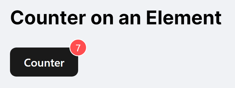
Counter (on existing elements)
Apply the same counter badge on an existing element to notify users of unread messages.
<NotificationCounter>
  <Button>Counter</Button>
</NotificationCounter>
Feed
The feed component provides a larger feed for browsing notifications. Notifications within the feed can also be clicked on to direct to links or pages, if any were set within the Notification template.
<NotificationFeed infiniteScrollHeight={300} />
Example:
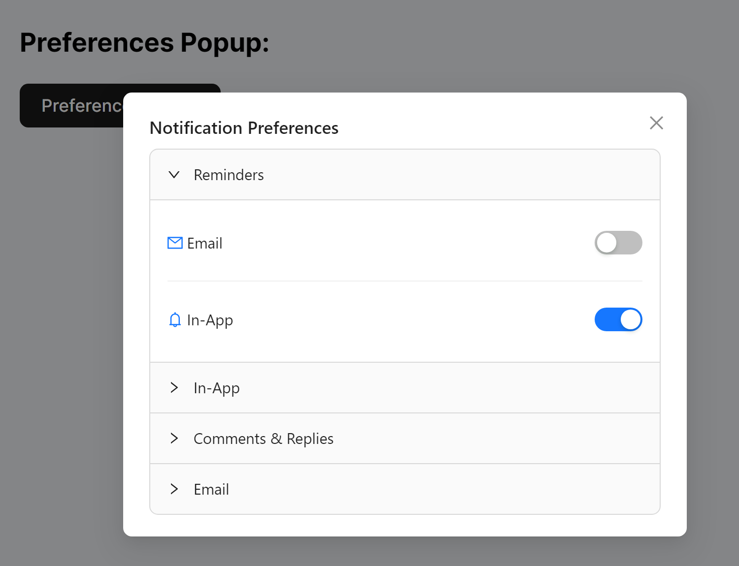
Notification Preferences Center
Preferences Popup
Our notification preferences popup allows users to set their preferences with your app. The component contains all your templates, and sliders for users to opt-in and out of notifications, and per channel where applicable.
const [preferencesPopupVisibility, setPreferencesPopupVisiblity] = React.useState(false);
<button onClick={() => setPreferencesPopupVisiblity(true)}>
  Preferences Popup
</button>
<NotificationPreferencesPopup
  open={preferencesPopupVisibility}
  onClose={() => {
    setPreferencesPopupVisiblity(false);
  }}
/>
Preferences Inline
Alternatively, we also offer an inline component for user preferences. Ideal for options & settings pages.
<NotificationPreferencesInline />
Example:
UI Customizations
Customizing the Button
Make our button fit in - or stand out. You can customize our button using the following parameters:
| Parameter | Type | Description |
|---|---|---|
| buttonIconSize | number | Determines the size of the icon used for the button. |
| buttonHeight | number | Determines the height of the button. |
| buttonWidth | number | Determines the width of the button. |
| iconColor | string | Determines the color of the icon used for the button. |
<NotificationPopup buttonIconSize={30} buttonHeight={50} buttonWidth={50} />
Customizing the Button (Launcher)
The launcher component takes additional parameters, allowing you to better position the button on your app.
| Parameter | Type | Description |
|---|---|---|
| offsetX | number or string | Determine a horizontal offset for your popup launcher. |
| offsetY | number or string | Determine a vertical offset for your popup launcher. |
| position | string: TOP_LEFT, TOP_RIGHT, BOTTOM_LEFT, BOTTOM_RIGHT | Determine which corner you want the popup launcher to anchor on. |
<NotificationLauncher buttonIconSize={30} offsetX={200} offsetY={100} />
Customizing the Header
You can change the header of your notifications to take your own custom React Component. You can modify the "Notifications" header found in the popup, feed, and launcher.
<NotificationPopup
  header={{
    title: <>"Notification"</>
  }}
/>
Customizing the Popup
Customize out popup to be the right fit for your app. Our Popup can be customized using these parameters:
| Parameter | Type | Description |
|---|---|---|
| count | ReactNode["count"] | Modify the appearance of the count on your popup. Behaves similarly to the Counter. |
| filter | string: ALL, UNARCHIVED | Filter which notifications appear. Set to ALL by default. |
| imageShape | string: circle, square | Determines the shape of images in the popup feed. Set to circle by default. |
| pagePosition | string: top, bottom | Determines whether the popup will render page buttons at the top or bottom of the component. Set to top by default. |
| pageSize | number | Requires pagination set to PAGINATED. Determines the amount of notifications shown per page. |
| pagination | string: INFINITE_SCROLL,PAGINATED | Choose between a single page or multiple pages for your inbox. Set to INFINITE_SCROLL by default |
| renderers | object: {notification: NotificationProps["renderer"], NotificationExtra["extraRenderer"] | Allows you to render custom & additional content. |
| unreadBadgeProps | UnreadBadgeProps | Modify the unread badge. Behaves similarly to the Counter. |
| popupWidth | number, string | Customize the width of the notifications popup. |
| popupHeight | number, string | Customize the height of the notifications popup. |
| popupZIndex | number | Set the Z Index value for the notification popup. Default value is 1030. |
| popoverPosition | anchorOrigin: { vertical: "center", "bottom", "top", horizontal: "center", "left", "right" | Set the position of the Notifications Popover relative to the Notification Popup Icon. |
<NotificationPopup
  imageShape="circle"
  pagination="PAGINATED"
  pageSize={4}
  pagePosition="bottom"
/>
Customizing the Feed
Customize the feed using these parameters:
| Parameter | Type | Description |
|---|---|---|
| filter | ReactNode | Filter the notifications that appear in your feed using a custom component. |
| header | ReactNode | Pass in a custom React component as your header. |
| imageShape | string: circle, square | Render images with the feed in a circle or square. Set to circle by default. |
| infiniteScrollHeight | number | Determine a height for the feed component. |
| pagePosition | string: bottom, top | Set a location for the page buttons. Requires pagination to be set to PAGINATED. Set to top by default. |
| pageSize | number | Adjust the number of notifications displayed per page. Requires pagination to be set to PAGINATED. |
| pagination | string: INFINITE_SCROLL, PAGINATED | Determines whether your feed is paginated, or one page for all notifications. Set to PAGINATED by default. |
| renderers | object: { notification: NotificationProps["renderer"] } | Render additional content within your feed. |
| style | Record<SemanticDOM, CSSProperties> | Pass in your styles to match our feed with your design. |
<NotificationFeed
  pagination="PAGINATED"
  pageSize={6}
  pagePosition="bottom"
  infiniteScrollHeight={300}
/>
Unread Badge
You can customize the unread badge through the unreadBadgeProps object. This object must adhere to the custom type UnreadBadgeProps, which is defined as follows:
| Parameter | Type | Description |
|---|---|---|
| bubbleColor | string | Customize the color for your badge |
| fontColor | string | Customize the text color of your badge |
| count | string: "COUNT_UNOPENED_NOTIFICATIONS", "COUNT_UNARCHIVED_NOTIFICATIONS", OR Custom | Customize what notifications are counted and the value displayed in the badge. See Logical Customizations for details |
| dot | boolean | If true, the badge will display as a dot instead of a badge with a number. |
| offset | object: { top: number, bottom: number, left: number, right: number } | Set an alternative location for the badge. |
| max | number | Badge displays a + beside your number when notifications exceed that amount. |
| showZero | boolean | Show a 0 on the badge when there are no new notifications. |
<NotificationPopup
  unreadBadgeProps={{
    bubbleColor="#000"
    fontColor="red"
    count= (n) => {
      return n.opened === 'true';
    }
    offSet={ top: 10, right: 10 }
    max=99
    showZero=true
  }}
/>
Pagination
You can use this to set up pages for your feed. Design scrollable, interactive inbox for your users through our component. Your feed can be modified further using these arguments:
| Parameter | Type | Description |
|---|---|---|
| bordered | boolean | Toggle a border for your feed. Set to false by default. |
| dataSource | any[] | Set a data source for your feed. |
| footer | ReactNode | Render a footer for your feed. |
| grid | object | Give your feed grid properties via JSON. |
| header | ReactNode | Render a header for your feed. |
| itemLayout | horizontal, vertical | Determine the layout of your feed. |
| loading | boolean+ | Show a loading symbol within the component when fetching your dataSource. False by default. |
| loadMore | ReactNode | Render a component to load more data for yuor feed. |
| locale | object | i18n text or empty text. |
| pagination | boolean, object | Set and modify pagination for your feed. Set to false by default. |
| renderItem | (item) => ReactNode | Define a custom list when using dataSource. |
| rowKey | keyof X, (item: X) => React.Key | Determine an item's key value. Can be either a unique value or a function that returns a value. |
| size | small, default, large | Adjust the size and spacing of your feed. |
| split | boolean | Toggle a visual separator for individual notifications in your feed. Set to false by default. |
Logical Customizations
Count
This refers to what notifications are counted in the counters or unread badges. You can use an existing mode or count the notifications by your own custom function:
COUNT_UNOPENED_NOTIFICATIONS(default): only counts notifications that are never seen/opened. Once the user opens the notification popup, the count will be reset to zero.COUNT_UNARCHIVED_NOTIFICATIONS: only counts the notifications that are not archived. The count will change when the user marks notifications as archived.- Custom: you can create your own function to count the notifications. The example code below counts notifications that belong to the
welcome_notificationcategory and are not archived.
<NotificationPopup
  count={(n) => {
    return n.notificationId === 'welcome_notification' && !n.archived;
  }}
/>
Filters
This refers to which notifications are rendered in the pre-existing popup, feed, ... components. You can filter notifications via existing modes or create your own custom function:
ALL(default): renders all notificationsUNARCHIVED: renders only notifications that are not archived- Custom: The example code below filters notifications that belong to the
welcome_notificationcategory and are not archived.
<NotificationPopup
  count={(n) => {
    return n.notificationId === 'welcome_notification' && !n.archived;
  }}
/>
Customizing each Notification
Headless (build your own UI)
You can build your own UI by reading the data inside our React Context object. It includes all our notification objects, users preferences, and functions for updating notification states. You can use these to build any notification UI you need.
Setup
Inside the components wrapped in our NotificationAPIProvider, you can access the context object using the useNotificationAPIContext hook:
export const MyComponent: React.FC = () => {
  const notificationapi = NotificationAPIProvider.useNotificationAPIContext();

  return (
    <Button
      onClick={() => {
        console.log(notificationapi.notifications);
      }}
    >
      Click to log notifications
    </Button>
  );
};
Accessing notification data
notificationapi.notifications;
Accessing user preferences
notificationapi.preferences;
Updating user preferences
notificationapi.updateDelivery(
  notificationId,
  channel,
  delivery,
  subNotificationId?
)
Marking loaded notifications as opened/seen
notificationapi.markAsOpened();
Marking notifications as archived
// to mark all as archived:
notificationapi.markAsArchived('ALL');

// to mark invididual notifications as archived:
notificationapi.markAsArchived(['trackingId1', 'trackingId2']);
Marking a notification as clicked
notificationapi.markAsClicked('trackingId');
asking for web push opt in
notificationapi.setWebPushOptIn(true);
Concepts
How does it work?
You trigger the API from the back-end and we store the notification. When users sign into the app, the sdk will pull their notification.
Websocket
We have our own websocket for sending & receiving new notifications. With this websocket, users will automatically receive new notifications without needing to refresh their pages. Since the websocket is automatically in place, developers don't need to do anything to implement this.
In-App Notification Object
The in-app notification object takes several arguments.
| Parameter | Type | Description |
|---|---|---|
| actioned1 | string | Coming soon! Assign a function for button 1 in your template, if a custom button has been assigned. |
| actioned2 | string | Coming soon! Assign a function for button 2 in your template, if a custom button has been assigned. |
| archived | string | Determines if the notification is considered as archived. Also referred to as "resolved". |
| body | ReactNode | Used to add your custom UI to your notification. |
| clicked | string | Determines if the notification has been clicked on by the recipient. |
| date | string | Using ISO 8607 formatting (YYYY-MM-DD), give your notification a date. |
| expDate | number | Give your notification a TTL by passing in a Unix timestamp (in sencods). The notification will expire once the timestamp has passed. |
| id | string | Your notification's tracking ID. Not the same as notificationId. |
| imageURL | string | Embed an image within your notification. |
| notificationId | string | The ID for your notification's template. |
| opened | string | Determines if the notification has been opened by the recipient. Notifications are considered opened if rendered onscreen for the recipient. |
| parameters | Record<string, unknown> | Mergetags. Give your notification mergetags/props that can pass values into matching mergetags within your notification templates. |
| redirectURL | string | Give your notification a link to send users to upon clicking. |
| replies | object: { date: string, message: string }[], | Coming soon - Contains user comments/replies to the notification if enabled. |
| title | string | A title for your in-app notification. |
identify
Stores the end-user information for a given user.
notificationapi
  .getClient()
  .identify({ id: '' }) // or mention the userId passed in the provider
  .then((result) => console.log(result));