🔔 In-App Notifications Widget
This document outlines all the features, common use-cases and best-practices for the in-app notifications widget.
This widget is part of our Front-end SDK which is written in Vanilla JavaScript, so it can be used in any JavaScript-based front-end framework like React, Angular and so on.
Relevant docs:
How It Works
- The widget automatically connects to our servers to pull notification data
- A live websocket connection is maintained to ensure that new notifications are delivered in real-time
- The widget will update our servers of events such as opens, clicks, dismissals, and more
- The library renders the UI elements necessary to show the notifications, for example the bell icon and the notification list
Display Modes
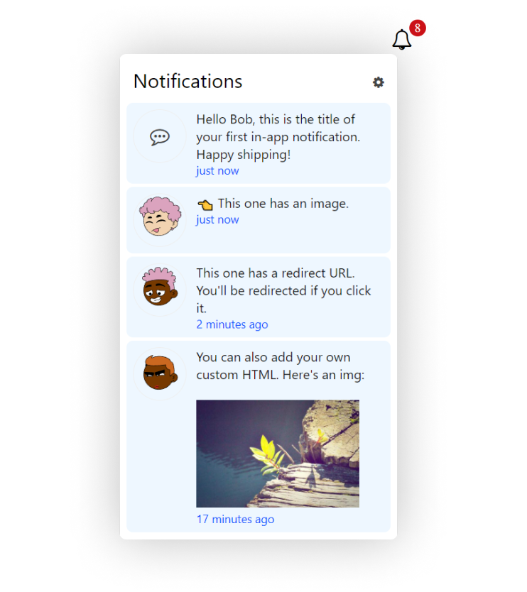
Popup Mode (Default)
By default, the showInApp() function will place a 🔔 button inside the selected root element. The button opens a popup which contains the notifications:
Inline Mode
With inline: true, there is no bell button or popup. Instead, the notifications are directly rendered onto the parent/root element:
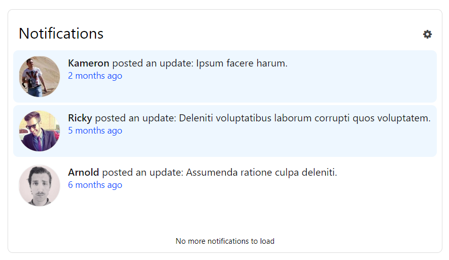
The inline mode is useful for creating a stand-alone Notifications page in your app, in combination with the paginated mode.
Mark as Read Modes
In-app notifications have a read/unread state. New notifications are always in the "unread" state. These notifications are highlighted to grab the attention of the user. Also note that the red notification counter displays the total number of unread notifications.
There are 3 ways the in-app notifications move to the "read" state:
Automatic (Default)
By default, when the in-app notifications are rendered, e.g. when the popup opens, they are also read.
Manual
With markAsReadMode: "MANUAL", users can set notifications to read using the "Mark All As Read" button, or by using the individual "Mark as read" on each notification.
Manual and Click
The markAsReadMode: "MANUAL_AND_CLICK" works similar to MANUAL mode, but also sets notifications to read when user clicks the notification.
Pagination
This refers to how many notifications are rendered in the widget.
Endless Scroll (Default)
By default, the in-app notifications are rendered in an endless scroll mode. This means that more notifications are loaded and rendered as the user scrolls down the list.
Paginated Mode
With pagination: true and pageSize: 2, only 2 notifications are rendered (animation below). Forward and backward navigation buttons allow the user to navigate to the next 2 notifications.

This mode is useful in combination with the inline mode to create a stand-alone Notifications page in your app.
Styling and Branding
There is no "NotificationAPI" branding on the in-app widget, even in our free tier.
And you can completely override the styles to make it match your own UI. You simply need to inspect the element you want to style, find the correct CSS class and customize it by writing your own CSS rules.
For example:
/* Change the icon */
.notificationapi-button .icon-bell-o:before {
  content: url('apple-whole-solid.svg');
}

/* Change the notification text size  */
.notificationapi-notification-title {
  font-size: 18px !important;
}